Summary sheet
sectorHospitality
area30 à 40m²
placeParis and Toulouse: 3 stores
delivery2021
Engaged Expertises
- Architectural Concept.
- Refurbishment.
Paris and Toulouse: 3 stores // 30 à 40m²
sectorHospitality
The globe-trotting croque-monsieur.
Michel Sarran, a two-starred chef, has always had a weakness: the croque-monsieur. An unavoidable dish of French bistronomy, the codes of which have been seen, revisited… and now revisited by Croq’Michel!
With his two daughters, he decided to dedicate a chain of restaurants to it in Toulouse, then in Paris. The menu offers colourful and flavourful croque-monsieur, thanks to a magical recipe:
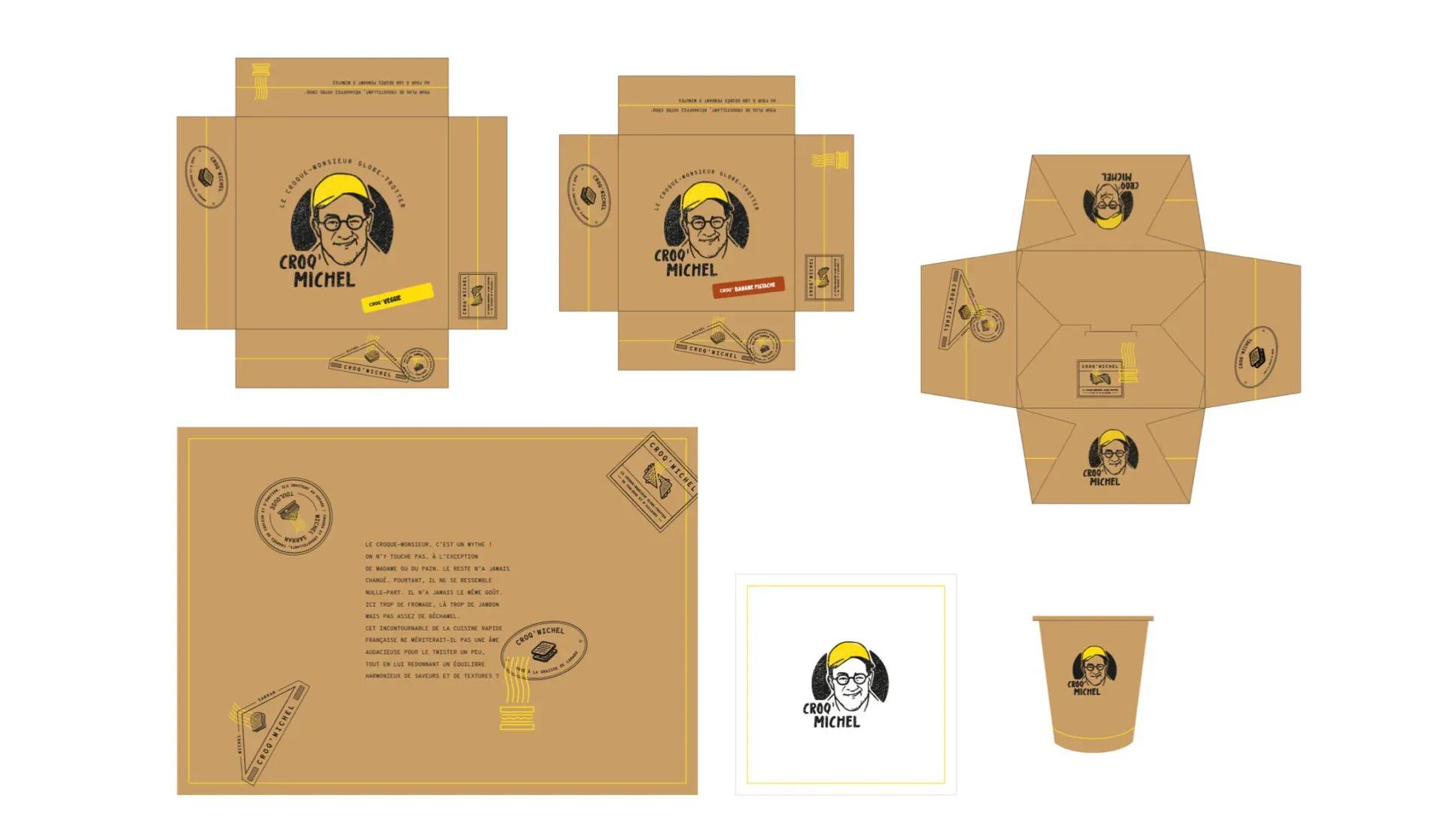
1- Keep the basics: two slices of toasted sandwich bread 2- Adding a pinch of its region – Gascony – by browning the bread in duck fat 3- Take the whole thing to the four corners of the world: Norway, Italy, Ibiza for an exotic touch. Packaged, it’s ready to eat!
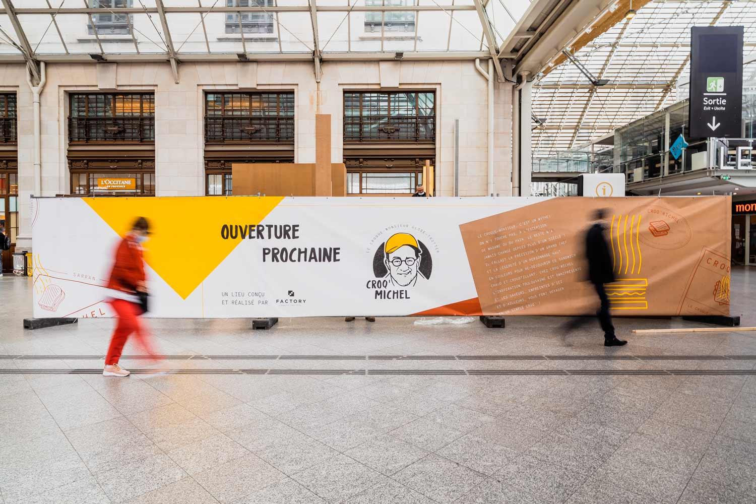
From this simple-looking idea, it was necessary to create a fully-fledged brand image that did not forget any of the essential ingredients. A touch of Gascony, street-food codes, Michel Sarran’s rock’n’roll personality, an invitation to travel: the challenge was to create a coherent universe with a graphic charter faithful to these fundamental principles, which could transport the croque-monsieur outside Parisian restaurants. First, a branding phase made it possible to establish the brand’s graphic and editorial codes, then to bring them to life with a strong architectural concept.
Giving an human face to the street-food.
Street food is a major consumer trend, with “speed” and “efficiency” being the key words today. Adapted to the new modes of catering, it has become omnipresent and demands that places be adapted to its requirements.
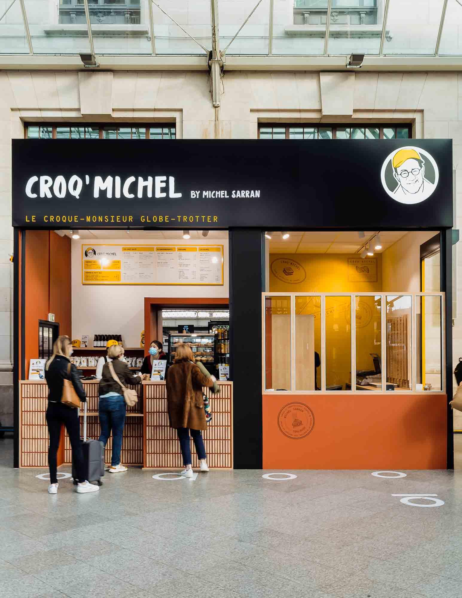
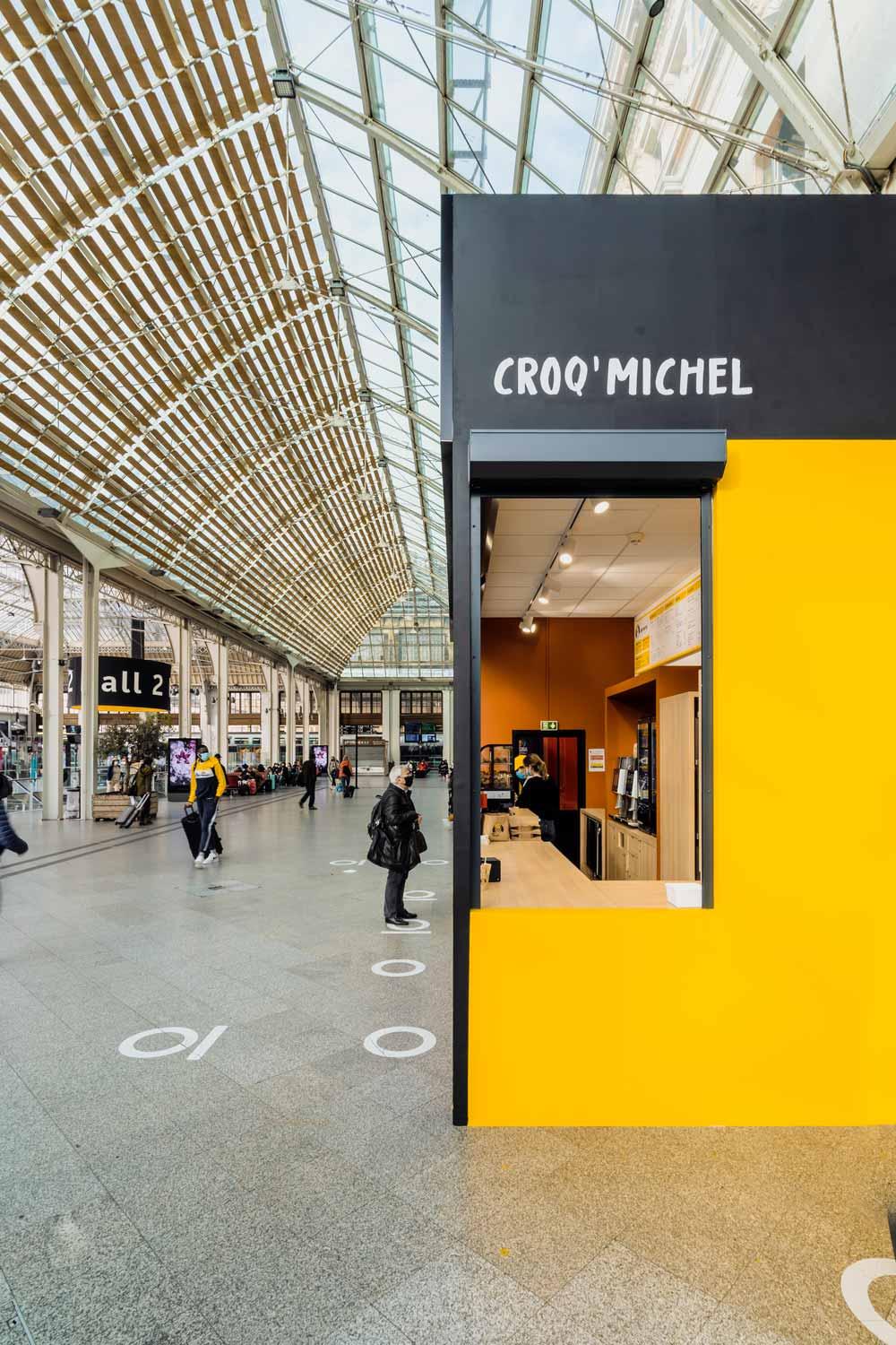
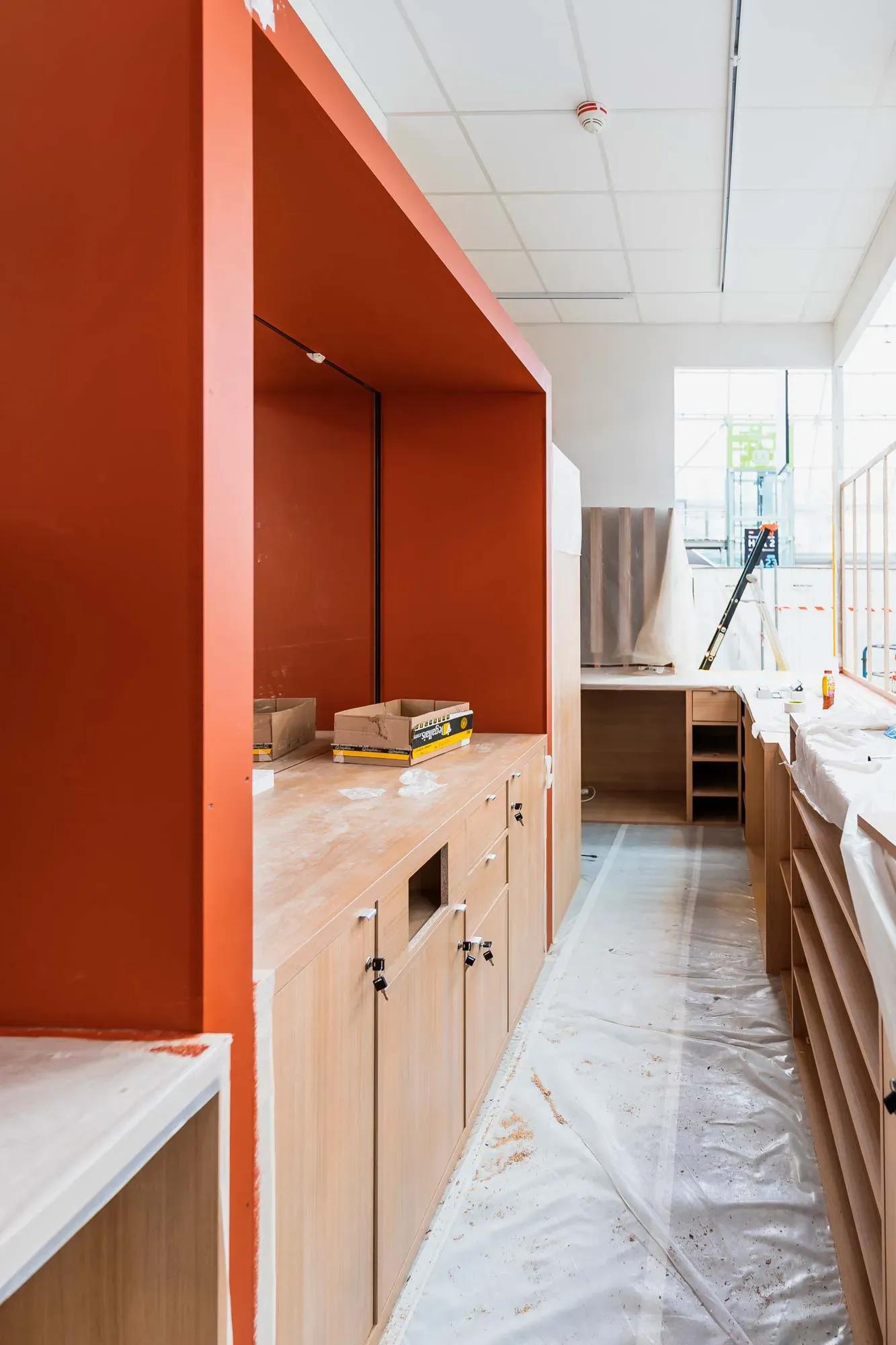
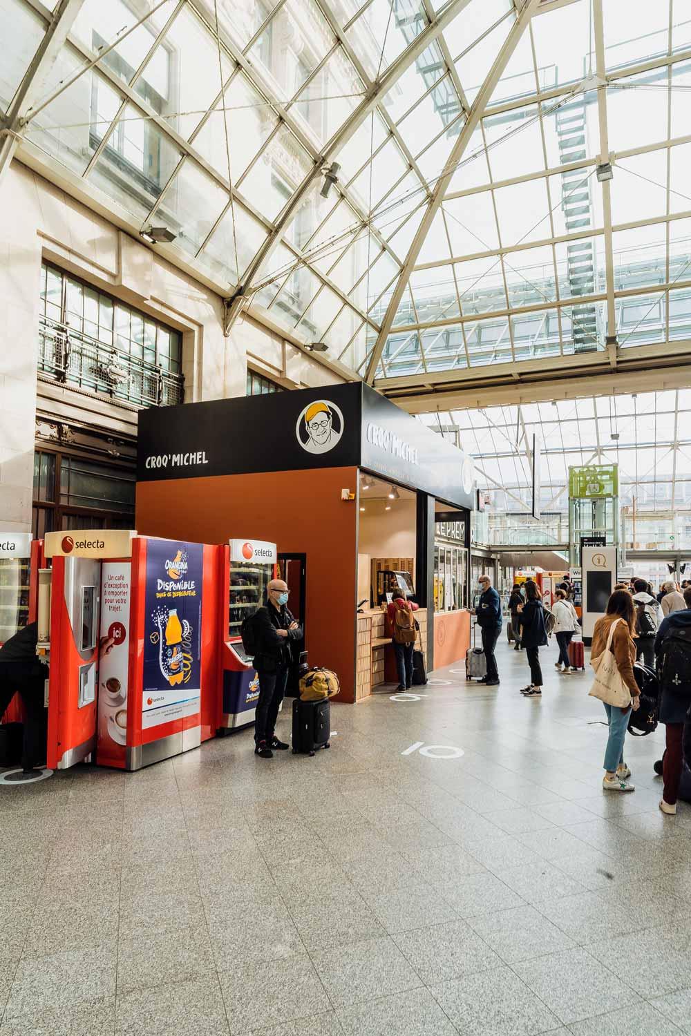
The shop has been designed according to these constraints, with the aim of turning them into assets. In the 30m2 allocated, the customer path was designed to be fluid and natural, offering an optimal user experience: first the order at the entrance of the shop, then the payment and finally the withdrawal. An opening to the outside in the manner of a stall – emblematic of street food – gives the possibility of ordering directly from the street. This makes it possible to pick up delivery men without having them pass through the shop, and thus to avoid an overload inside!
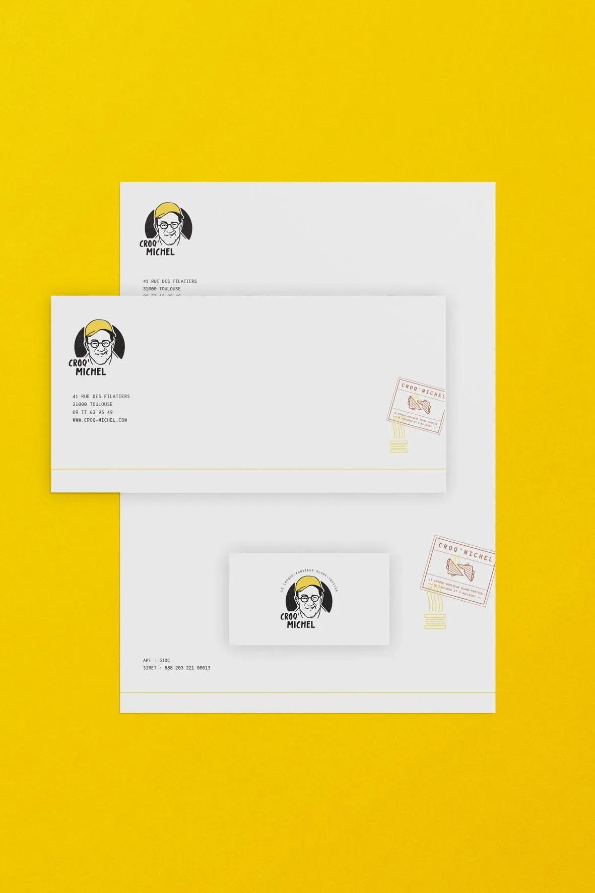
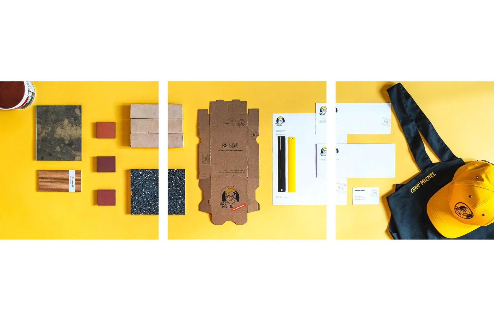
Unfortunately, speed is often synonymous with coldness and distance. So we had to counterbalance these codes with a warm and cheerful atmosphere. How did we do this? By means of a brand storytelling – almost eponymous – embodied by its creator, who himself enjoys a high level of sympathy. Michel Sarran’s personality shines through in the various choices: a logo with the chef’s head and his famous yellow cap and the presence of black, the colour of his apron with which he obtained his second star. It is also a general atmosphere that emerges with a warm ambiance thanks to the sunny effect of yellow, characteristic of Chef Sarran’s legendary good humour. The result is a resolutely modern brand that has all the makings of street food… with the bonus of joviality!
A croque-monsieur browned with duck grease, with exotic flavours: this is the promise of taste, and the promise of a restaurant experience! Bringing together the here and the there: the Croq’Michel restaurants combine the codes of the region where they are located – Toulouse – with those of travel.
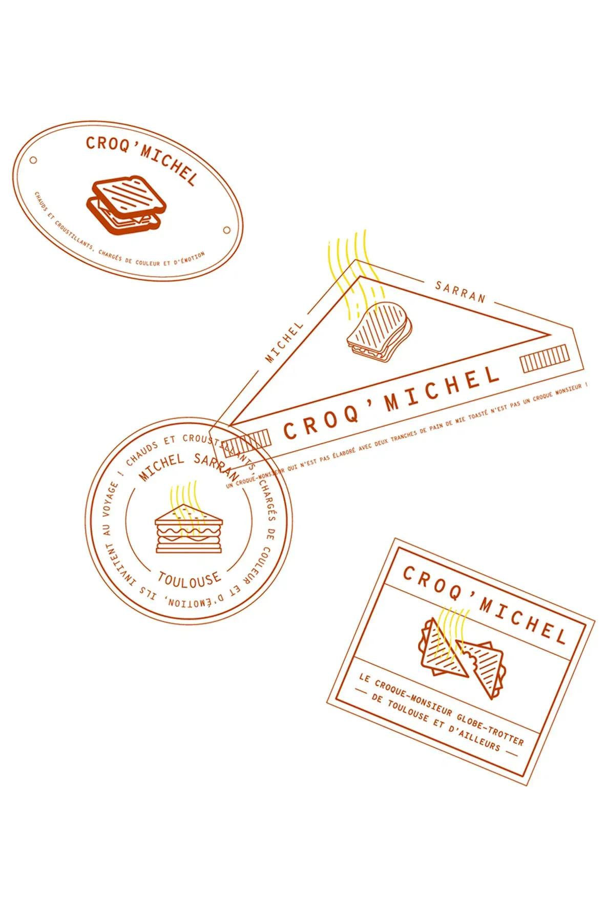
The design of the place resembles a stall with its opening to the outside, bringing that touch of exoticism by recalling the street food restaurants of Asia or even South America. An architectural structure that allows to have strong and clearly identifiable totemic markers: the bricks and the bar that makes the link between the interior and the exterior. In the restaurant, several decorative elements accentuate this invitation to travel: frames of photos of street stalls, neon lights with pictograms of stamps from cities around the world and the packaging of the croque-monsieur which uses these same illustrations, giving a postcard effect!
The Toulouse roots are also clearly identifiable thanks to the selection of materials: a pink brick typical of the region in the front; placed vertically so it doesn’t look like New-York. This terraccotta pink is also found in the graphic charter, alongside the sunny yellow and the elegant, rock’n’roll black.
Revisiting a classic while keeping it simple.
To uproot a classic such as the croque-monsieur, it was essential to create a strong identity for it. Associated with the image of a chef, it could have become gastronomic and sophisticated, which would have been completely contradictory to the very essence of the croque-monsieur: a simple, almost regressive pleasure. Each element is therefore designed to give a feeling of simplicity and accessibility!
The revisit is culinary thanks to an original menu, but it is also experiential with an assertive architectural storytelling: a restaurant that revisits known codes (the stall, the brick, the image of the chef) to take you elsewhere. The visitor of Croq’Michel travels to Gascony and to the other side of the world. He travels from the front of the shop to the last bite of his croque-monsieur!
Summary sheet
sectorHospitality
area30 à 40m²
placeParis and Toulouse: 3 stores
delivery2021
Engaged Expertises
Share the project
Next design
Boulogne-Billancourt // 1500m²
MWM